Field Value Goal Customize UI Kit appearance (colors, fonts, dark mode) via CSS variables Where App.css (global) — imported in app entry via import "./App.css";Step 1 Import base stylesheet: @import url("@cometchat/chat-uikit-react/css-variables.css"); Step 2 Override variables on .cometchat (global) or .cometchat-<component> (component-specific) Step 3 (dark mode) Override on .cometchat-root[data-theme="dark"] .cometchat or use @media (prefers-color-scheme: dark) Key tokens --cometchat-primary-color, --cometchat-neutral-color-300, --cometchat-font-family, --cometchat-background-color-03Constraints Global CSS only (no CSS Modules), no !important, component-level overrides beat global Full token list Color Resources | GitHub source
Theming controls the look and feel of the chat UI — colors, fonts, and other styles — through CSS variables.
Root Wrapper (.cometchat) All selectors in this doc are scoped under .cometchat, the class the UI Kit renders on its root element.
export default function App () { return ( < div className = "cometchat-root" > { /* UI Kit components */ } </ div > ); }
For data-theme, place it on the wrapper and scope dark theme overrides to .cometchat inside.
Theming Contract Inputs
Base stylesheet import: @import url("@cometchat/chat-uikit-react/css-variables.css");
Global CSS variables on .cometchat
Component-scoped variables on .cometchat .cometchat-<component>
Optional element-level CSS overrides for specific selectors
Optional theme mode selector: .cometchat-root[data-theme="dark"] .cometchat or @media (prefers-color-scheme: dark)
Precedence
Element-level CSS overrides (most specific)
Component-scoped variables (.cometchat .cometchat-conversations { --var })
Global variables (.cometchat { --var })
Defaults from css-variables.css (least specific)
Outputs
Primary tokens change outgoing bubbles, buttons, and active states
Background tokens change panels and surfaces
Text/icon tokens change highlight accents
Font tokens change typography across the UI
Importing the Stylesheet @import url ( "@cometchat/chat-uikit-react/css-variables.css" );
Global Theming with CSS Variables Override CSS variables in the global stylesheet to customize the entire chat UI.
Use App.css for global overrides scoped under .cometchat. Use the runtime setProperty approach only for live theme changes without a reload.
App.css (Recommended)
App.tsx (Runtime Only)
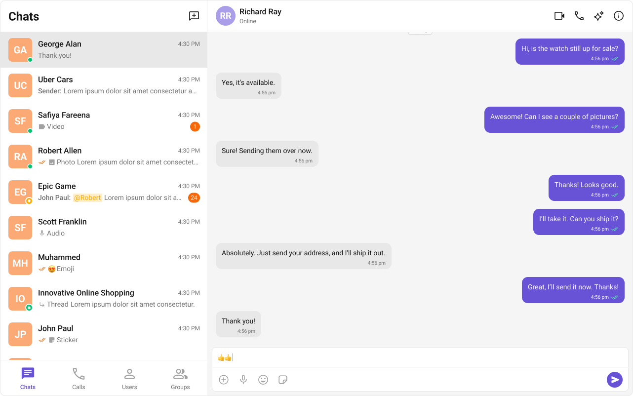
.cometchat { --cometchat-primary-color : #f76808 ; --cometchat-neutral-color-300 : #E8E8E8 ; --cometchat-background-color-03 : #feede1 ; --cometchat-extended-primary-color-500 : #fbaa75 ; --cometchat-icon-color-highlight : #f76808 ; --cometchat-text-color-highlight : #f76808 ; }
import { useEffect } from "react" ; const App = () => { useEffect (() => { document . documentElement . style . setProperty ( "--cometchat-font-family" , "'Times New Roman'" ); }, []); return < div className = "cometchat-root" > { /* Chat UI here */ } </ div > ; }; export default App ;
All primary-colored elements (outgoing bubbles, buttons, active states, links) change to orange (#f76808). Background panels change to light peach (#feede1). Font changes to Times New Roman.
Top Tokens (Quick Mapping) For the complete list, see Color Resources .
Token Common usage --cometchat-primary-colorPrimary accent color (buttons, outgoing bubbles, active states) --cometchat-extended-primary-color-900Darker primary shade (outgoing bubble shade) --cometchat-extended-primary-color-500Mid primary shade (secondary accents/hover) --cometchat-neutral-color-300Neutral surface (incoming bubbles/panels) --cometchat-background-color-03Panel background surface --cometchat-text-color-highlightHighlight text color --cometchat-icon-color-highlightHighlight icon color --cometchat-message-seen-colorSeen/read indicator color --cometchat-font-familyGlobal font family ('Roboto', 'Inter' default) --cometchat-radius-maxMaximum corner radius used across UI elements
Component-Specific Theming Override CSS variables within a component’s class to apply different styles to specific components.
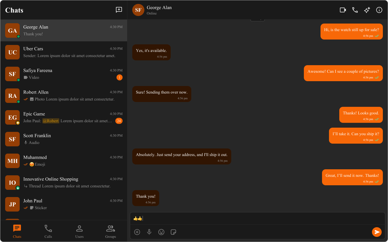
.cometchat .cometchat-conversations { --cometchat-primary-color : #f76808 ; --cometchat-extended-primary-color-500 : #fbaa75 ; --cometchat-text-color-highlight : #ffab00 ; --cometchat-message-seen-color : #f76808 ; --cometchat-radius-max : 12 px ; }
Only the Conversations component changes — primary color becomes orange, highlight text becomes amber, avatars get 12px border radius. Other components remain unchanged.
Advanced Customization with CSS Overrides Target specific elements directly for full control over component styling.
.cometchat-conversations .cometchat-avatar , .cometchat-conversations .cometchat-avatar__image { border-radius : 12 px ; }
Avatar images in the Conversations list change from circular to rounded-square (12px radius).
Dark and Light Theme Support Choose ONE dark mode strategy:
App-controlled: set data-theme on the wrapper (e.g., .cometchat-root) and scope overrides like .cometchat-root[data-theme="dark"] .cometchat { ... }
OS-controlled: use @media (prefers-color-scheme: dark) scoped to .cometchat
Enabling Dark Mode import { useEffect , useState } from "react" ; const App = () => { const [ theme , setTheme ] = useState ( "light" ); useEffect (() => { const mediaQuery = window . matchMedia ( "(prefers-color-scheme: dark)" ); setTheme ( mediaQuery . matches ? "dark" : "light" ); const handleThemeChange = ( e : MediaQueryListEvent ) => { setTheme ( e . matches ? "dark" : "light" ); }; mediaQuery . addEventListener ( "change" , handleThemeChange ); return () => mediaQuery . removeEventListener ( "change" , handleThemeChange ); }, []); return < div className = "cometchat-root" data-theme = { theme } > { /* Chat UI here */ } </ div > ; }; export default App ;
The wrapper tracks the user’s OS preference and sets data-theme, which switches palettes in CSS.
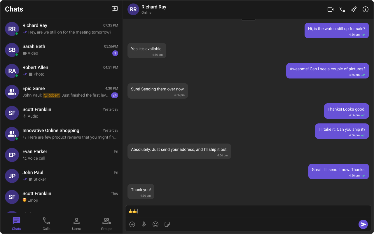
Customizing Light and Dark Theme /* Default (Light) Theme */ .cometchat { --cometchat-primary-color : #f76808 ; --cometchat-neutral-color-300 : #E8E8E8 ; --cometchat-background-color-03 : #feede1 ; --cometchat-extended-primary-color-500 : #fbaa75 ; --cometchat-icon-color-highlight : #f76808 ; --cometchat-text-color-highlight : #f76808 ; } /* Dark Theme */ .cometchat-root [ data-theme = "dark" ] .cometchat { --cometchat-primary-color : #f76808 ; --cometchat-neutral-color-300 : #311502 ; --cometchat-background-color-03 : #451d02 ; --cometchat-extended-primary-color-500 : #943e05 ; --cometchat-icon-color-highlight : #f76808 ; --cometchat-text-color-highlight : #f76808 ; --cometchat-message-seen-color : #f76808 ; --cometchat-neutral-color-50 : #1a1a1a ; }
For OS-controlled dark mode, wrap the dark overrides in @media (prefers-color-scheme: dark) and keep the .cometchat scope.
Light mode uses orange (#f76808) with peach backgrounds; dark mode uses the same orange accent but with dark brown backgrounds (#311502, #451d02) for proper contrast.
Examples Brand color swap (global) .cometchat { --cometchat-primary-color : #0f766e ; --cometchat-extended-primary-color-500 : #14b8a6 ; --cometchat-text-color-highlight : #0f766e ; --cometchat-icon-color-highlight : #0f766e ; }
Primary accents, buttons, and active states switch to teal.
Dark mode (app-controlled) .cometchat-root [ data-theme = "dark" ] .cometchat { --cometchat-background-color-03 : #121212 ; --cometchat-neutral-color-300 : #1e1e1e ; --cometchat-text-color-highlight : #f76808 ; }
Panels and surfaces darken while accents remain visible.
Conversations-only override .cometchat .cometchat-conversations { --cometchat-primary-color : #f76808 ; --cometchat-message-seen-color : #f76808 ; --cometchat-radius-max : 12 px ; }
Only the Conversations component changes; other components stay default.
Bubble styling (incoming/outgoing) .cometchat .cometchat-message-bubble-outgoing .cometchat-message-bubble__body { --cometchat-primary-color : #f76808 ; --cometchat-extended-primary-color-900 : #fbaa75 ; } .cometchat .cometchat-message-bubble-incoming .cometchat-message-bubble__body { --cometchat-neutral-color-300 : #f1f5f9 ; }
Outgoing bubbles use orange; incoming bubbles use a light slate. For more variants, see Message Bubble Styling .
Resources UI Kit Source Code Complete list of color variables and hex values on GitHub. View on GitHub Figma UI Kit Figma UI Kit with fully integrated color palette. View on Figma 