{
  "component": "CometChatMessageHeader",
  "package": "@cometchat/chat-uikit-react",
  "import": "import { CometChatMessageHeader } from \"@cometchat/chat-uikit-react\";",
  "cssImport": "import \"@cometchat/chat-uikit-react/css-variables.css\";",
  "description": "Toolbar displaying user/group avatar, name, status, typing indicator, back button, and call controls for a single conversation.",
  "cssRootClass": ".cometchat-message-header",
  "note": "View slots are JSX.Element (not functions) — unlike list components.",
  "props": {
    "data": {
      "user": { "type": "CometChat.User", "default": "undefined" },
      "group": { "type": "CometChat.Group", "default": "undefined" },
      "lastActiveAtDateTimeFormat": { "type": "CalendarObject", "default": "component default" },
      "summaryGenerationMessageCount": { "type": "number", "default": 1000 }
    },
    "callbacks": {
      "onBack": "() => void",
      "onError": "((error: CometChat.CometChatException) => void) | null",
      "onItemClick": "() => void",
      "onSearchOptionClicked": "() => void"
    },
    "visibility": {
      "showBackButton": { "type": "boolean", "default": false },
      "hideVideoCallButton": { "type": "boolean", "default": false },
      "hideVoiceCallButton": { "type": "boolean", "default": false },
      "hideUserStatus": { "type": "boolean", "default": false },
      "showConversationSummaryButton": { "type": "boolean", "default": false },
      "showSearchOption": { "type": "boolean", "default": false },
      "enableAutoSummaryGeneration": { "type": "boolean", "default": false }
    },
    "viewSlots": {
      "itemView": "JSX.Element",
      "leadingView": "JSX.Element",
      "titleView": "JSX.Element",
      "subtitleView": "JSX.Element",
      "trailingView": "JSX.Element",
      "auxiliaryButtonView": "JSX.Element"
    }
  },
  "sdkListeners": [
    "onUserOnline",
    "onUserOffline",
    "onTypingStarted",
    "onTypingEnded",
    "onGroupMemberJoined",
    "onGroupMemberLeft",
    "onGroupMemberKicked",
    "onGroupMemberBanned",
    "onMemberAddedToGroup"
  ],
  "types": {
    "CalendarObject": {
      "today": "string | undefined",
      "yesterday": "string | undefined",
      "lastWeek": "string | undefined",
      "otherDays": "string | undefined",
      "relativeTime": {
        "minute": "string | undefined",
        "minutes": "string | undefined",
        "hour": "string | undefined",
        "hours": "string | undefined"
      }
    }
  }
}

Where It Fits

CometChatMessageHeader is a toolbar component that sits above CometChatMessageList and CometChatMessageComposer. It receives a user or group prop and displays the conversation’s avatar, name, online status, and typing indicator. Call buttons are rendered automatically when the calling extension is enabled.
import { useEffect, useState } from "react";
import {
  CometChatMessageHeader,
  CometChatMessageList,
  CometChatMessageComposer,
} from "@cometchat/chat-uikit-react";
import { CometChat } from "@cometchat/chat-sdk-javascript";
import "@cometchat/chat-uikit-react/css-variables.css";

function ChatView() {
  const [user, setUser] = useState<CometChat.User>();

  useEffect(() => {
    CometChat.getUser("UID").then(setUser);
  }, []);

  if (!user) return null;

  return (
    <div style={{ display: "flex", flexDirection: "column", height: "100vh" }}>
      <CometChatMessageHeader user={user} />
      <CometChatMessageList user={user} />
      <CometChatMessageComposer user={user} />
    </div>
  );
}

Minimal Render

import { useEffect, useState } from "react";
import { CometChatMessageHeader } from "@cometchat/chat-uikit-react";
import { CometChat } from "@cometchat/chat-sdk-javascript";
import "@cometchat/chat-uikit-react/css-variables.css";

function MessageHeaderDemo() {
  const [user, setUser] = useState<CometChat.User>();

  useEffect(() => {
    CometChat.getUser("UID").then(setUser);
  }, []);

  return user ? <CometChatMessageHeader user={user} /> : null;
}

export default MessageHeaderDemo;
Root CSS class: .cometchat-message-header

Actions and Events

Callback Props

onBack

Fires when the back button is clicked. Requires showBackButton={true}.
import { CometChatMessageHeader } from "@cometchat/chat-uikit-react";
import { CometChat } from "@cometchat/chat-sdk-javascript";

function HeaderWithBack({ user }: { user: CometChat.User }) {
  return (
    <CometChatMessageHeader
      user={user}
      showBackButton={true}
      onBack={() => console.log("Navigate back")}
    />
  );
}

onItemClick

Fires when the header list item area (avatar + name) is clicked.
import { CometChatMessageHeader } from "@cometchat/chat-uikit-react";
import { CometChat } from "@cometchat/chat-sdk-javascript";

function HeaderWithItemClick({ user }: { user: CometChat.User }) {
  return (
    <CometChatMessageHeader
      user={user}
      onItemClick={() => console.log("Open user detail")}
    />
  );
}

onSearchOptionClicked

Fires when the search option is clicked. Requires showSearchOption={true}.
import { CometChatMessageHeader } from "@cometchat/chat-uikit-react";
import { CometChat } from "@cometchat/chat-sdk-javascript";

function HeaderWithSearch({ user }: { user: CometChat.User }) {
  return (
    <CometChatMessageHeader
      user={user}
      showSearchOption={true}
      onSearchOptionClicked={() => console.log("Open search")}
    />
  );
}

onError

Fires on internal errors.
import { CometChatMessageHeader } from "@cometchat/chat-uikit-react";
import { CometChat } from "@cometchat/chat-sdk-javascript";

function HeaderWithError({ user }: { user: CometChat.User }) {
  return (
    <CometChatMessageHeader
      user={user}
      onError={(error: CometChat.CometChatException) => {
        console.error("MessageHeader error:", error);
      }}
    />
  );
}

SDK Events (Real-Time, Automatic)

The component listens to these SDK events internally. No manual attachment needed.
SDK ListenerInternal behavior
onUserOnline / onUserOfflineUpdates the user’s online/offline status indicator
onTypingStarted / onTypingEndedShows/hides the typing indicator in the subtitle area
Group member eventsUpdates group member count when members join/leave
In React 18 StrictMode, useEffect runs twice on mount in development. The component handles listener cleanup internally.

Custom View Slots

View slots for CometChatMessageHeader are JSX.Element (not functions) — unlike list components where slots receive a data parameter.
SlotTypeReplaces
itemViewJSX.ElementEntire list item (avatar + name + subtitle)
leadingViewJSX.ElementAvatar / left section
titleViewJSX.ElementName / title text
subtitleViewJSX.ElementSubtitle text (status / typing indicator)
trailingViewJSX.ElementRight section (call buttons area)
auxiliaryButtonViewJSX.ElementAuxiliary button area (next to call buttons)

itemView

Replace the entire list item (avatar + name + subtitle).
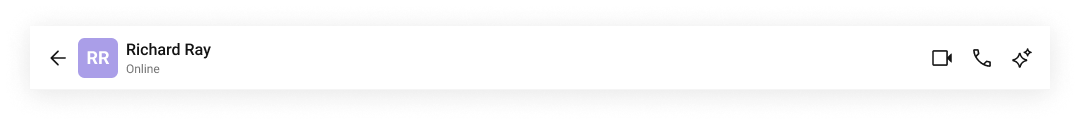
import {
  CometChatMessageHeader,
  CometChatListItem,
} from "@cometchat/chat-uikit-react";
import { CometChat } from "@cometchat/chat-sdk-javascript";

function CustomItemViewHeader({ user }: { user: CometChat.User }) {
  return (
    <CometChatMessageHeader
      user={user}
      itemView={
        <CometChatListItem
          avatarName={user.getName()}
          avatarURL={user.getAvatar()}
          title={user.getName()}
          subtitleView={user.getStatus()}
        />
      }
      showBackButton={true}
    />
  );
}

titleView

Replace the name / title text.
import { CometChatMessageHeader } from "@cometchat/chat-uikit-react";
import { CometChat } from "@cometchat/chat-sdk-javascript";

function CustomTitleHeader({ user }: { user: CometChat.User }) {
  return (
    <CometChatMessageHeader
      user={user}
      titleView={
        <div className="message-header__title-view">
          <span className="message-header__title-view-name">
            {user.getName() + " • "}
          </span>
          <span className="message-header__title-view-status">
            {user.getStatusMessage()}
          </span>
        </div>
      }
    />
  );
}

subtitleView

Replace the subtitle text (status / typing indicator area).
import { CometChatMessageHeader } from "@cometchat/chat-uikit-react";
import { CometChat } from "@cometchat/chat-sdk-javascript";

function CustomSubtitleHeader({ group }: { group: CometChat.Group }) {
  return (
    <CometChatMessageHeader
      group={group}
      subtitleView={
        <>{group.getMembersCount() + " • " + group.getDescription()}</>
      }
    />
  );
}

leadingView

Replace the avatar / left section.
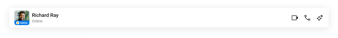
import {
  CometChatMessageHeader,
  CometChatAvatar,
} from "@cometchat/chat-uikit-react";
import { CometChat } from "@cometchat/chat-sdk-javascript";

function CustomLeadingHeader({ user }: { user: CometChat.User }) {
  return (
    <CometChatMessageHeader
      user={user}
      leadingView={
        <div className="message-header__leading-view">
          <CometChatAvatar image={user.getAvatar()} name={user.getName()} />
          <span className="message-header__leading-view-role">
            {user.getRole()}
          </span>
        </div>
      }
    />
  );
}

trailingView

Replace the right section (call buttons area).
import {
  CometChatMessageHeader,
  CometChatButton,
} from "@cometchat/chat-uikit-react";
import { CometChat } from "@cometchat/chat-sdk-javascript";

function CustomTrailingHeader({ user }: { user: CometChat.User }) {
  return (
    <CometChatMessageHeader
      user={user}
      trailingView={
        <CometChatButton onClick={() => { /* custom action */ }} />
      }
    />
  );
}

auxiliaryButtonView

Replace the auxiliary button area (next to call buttons).
import {
  CometChatMessageHeader,
  CometChatButton,
} from "@cometchat/chat-uikit-react";
import { CometChat } from "@cometchat/chat-sdk-javascript";

function AuxiliaryButtonHeader({ group }: { group: CometChat.Group }) {
  return (
    <CometChatMessageHeader
      group={group}
      auxiliaryButtonView={
        <CometChatButton onClick={() => { /* custom action */ }} />
      }
    />
  );
}

lastActiveAtDateTimeFormat

Customize the “last seen” timestamp format using a CalendarObject.
import {
  CometChatMessageHeader,
  CalendarObject,
} from "@cometchat/chat-uikit-react";
import { CometChat } from "@cometchat/chat-sdk-javascript";

function CustomDateHeader({ user }: { user: CometChat.User }) {
  const dateFormat = new CalendarObject({
    today: "hh:mm A",
    yesterday: "[yesterday]",
    otherDays: "DD MM YYYY",
  });

  return (
    <CometChatMessageHeader
      user={user}
      lastActiveAtDateTimeFormat={dateFormat}
    />
  );
}
If no property is passed in the CalendarObject, the component checks the global configuration first. If also missing there, the component’s default formatting applies.

Common Patterns

import { CometChatMessageHeader } from "@cometchat/chat-uikit-react";
import { CometChat } from "@cometchat/chat-sdk-javascript";

function FullFeaturedHeader({ user }: { user: CometChat.User }) {
  return (
    <CometChatMessageHeader
      user={user}
      showBackButton={true}
      showSearchOption={true}
      onBack={() => { /* navigate back */ }}
      onSearchOptionClicked={() => { /* open search */ }}
    />
  );
}

Hide call buttons

import { CometChatMessageHeader } from "@cometchat/chat-uikit-react";
import { CometChat } from "@cometchat/chat-sdk-javascript";

function NoCalls({ user }: { user: CometChat.User }) {
  return (
    <CometChatMessageHeader
      user={user}
      hideVideoCallButton={true}
      hideVoiceCallButton={true}
    />
  );
}

Group header with AI summary

import { CometChatMessageHeader } from "@cometchat/chat-uikit-react";
import { CometChat } from "@cometchat/chat-sdk-javascript";

function GroupHeaderWithSummary({ group }: { group: CometChat.Group }) {
  return (
    <CometChatMessageHeader
      group={group}
      showConversationSummaryButton={true}
      enableAutoSummaryGeneration={true}
      summaryGenerationMessageCount={500}
    />
  );
}

CSS Architecture

The component uses CSS custom properties (design tokens) defined in @cometchat/chat-uikit-react/css-variables.css. The cascade:
  1. Global tokens are set on the .cometchat root wrapper.
  2. Component CSS (.cometchat-message-header) consumes these tokens via var() with fallback values.
  3. Overrides target .cometchat-message-header descendant selectors in a global stylesheet.

Key Selectors

TargetSelector
Root.cometchat-message-header
List item.cometchat-message-header .cometchat-list-item
Body title.cometchat-message-header .cometchat-list-item__body-title
Avatar.cometchat-message-header .cometchat-list-item .cometchat-avatar
Leading view.cometchat-message-header .cometchat-list-item__leading-view
Trailing view.cometchat-message-header .cometchat-list-item__trailing-view
Subtitle.cometchat-message-header__subtitle
Subtitle (typing).cometchat-message-header__subtitle-typing
Back button.cometchat-message-header__back-button
Auxiliary button view.cometchat-message-header__auxiliary-button-view
List item container.cometchat-message-header__listitem
Title container.cometchat-message-header .cometchat-list-item__title-container

Example: Brand-themed header

.cometchat-message-header .cometchat-list-item .cometchat-avatar {
  background: #f0999b;
  border-radius: 8px;
}

.cometchat-message-header .cometchat-avatar__text {
  font-family: "SF Pro";
}

Customization Matrix

What to changeWhereProperty/APIExample
Override behavior on user interactionComponent propson<Event> callbacksonBack={() => navigate(-1)}
Toggle visibility of UI elementsComponent propshide<Feature> / show<Feature> boolean propshideVideoCallButton={true}
Replace a section of the headerComponent props<slot>View JSX.Element propstitleView={<div>Custom</div>}
Change colors, fonts, spacingGlobal CSSTarget .cometchat-message-header class.cometchat-message-header .cometchat-avatar { border-radius: 8px; }

Accessibility

The component renders a toolbar with interactive elements. The back button, call buttons, and auxiliary buttons are keyboard-focusable and activate on Enter/Space. The avatar includes alt text. The typing indicator updates the subtitle text dynamically — screen readers announce the change via live region behavior.

Props

All props are optional unless noted otherwise.

auxiliaryButtonView

Custom component for the auxiliary button area.
TypeJSX.Element
Defaultundefined

enableAutoSummaryGeneration

Enables automatic conversation summary generation.
Typeboolean
Defaultfalse

group

Displays group details in the header.
TypeCometChat.Group
Defaultundefined
Pass either user or group, not both.

hideBackButton

Hides the back navigation button. Deprecated — use showBackButton instead.
Typeboolean
Defaulttrue

hideUserStatus

Hides the user’s online/offline status indicator.
Typeboolean
Defaultfalse

hideVideoCallButton

Hides the video call button.
Typeboolean
Defaultfalse

hideVoiceCallButton

Hides the voice call button.
Typeboolean
Defaultfalse

itemView

Custom component for the entire list item.
TypeJSX.Element
Defaultundefined

lastActiveAtDateTimeFormat

Format for displaying the “last seen” timestamp.
TypeCalendarObject
DefaultComponent default

leadingView

Custom component for the avatar / left section.
TypeJSX.Element
Defaultundefined

onBack

Callback fired when the back button is clicked.
Type() => void
Default() => {}

onError

Callback fired when the component encounters an error.
Type((error: CometChat.CometChatException) => void) | null
Defaultundefined

onItemClick

Callback fired when the header list item is clicked.
Type() => void
Default() => {}

onSearchOptionClicked

Callback fired when the search option is clicked.
Type() => void
Default() => {}

showBackButton

Shows the back navigation button.
Typeboolean
Defaultfalse

showConversationSummaryButton

Shows the AI conversation summary button.
Typeboolean
Defaultfalse

showSearchOption

Shows the search option in the header.
Typeboolean
Defaultfalse

subtitleView

Custom component for the subtitle text.
TypeJSX.Element
Defaultundefined

summaryGenerationMessageCount

Number of messages used for AI summary generation.
Typenumber
Default1000

titleView

Custom component for the name / title text.
TypeJSX.Element
Defaultundefined

trailingView

Custom component for the right section.
TypeJSX.Element
Defaultundefined

user

Displays user details in the header.
TypeCometChat.User
Defaultundefined
Pass either user or group, not both.

CSS Selectors

TargetSelector
Root.cometchat-message-header
List item.cometchat-message-header .cometchat-list-item
Body title.cometchat-message-header .cometchat-list-item__body-title
Avatar.cometchat-message-header .cometchat-list-item .cometchat-avatar
Leading view.cometchat-message-header .cometchat-list-item__leading-view
Trailing view.cometchat-message-header .cometchat-list-item__trailing-view
Subtitle.cometchat-message-header__subtitle
Subtitle (typing).cometchat-message-header__subtitle-typing
Back button.cometchat-message-header__back-button
Auxiliary button view.cometchat-message-header__auxiliary-button-view
List item container.cometchat-message-header__listitem
Title container.cometchat-message-header .cometchat-list-item__title-container
Summary button.cometchat-message-header__conversation-summary-button
Search button.cometchat-message-header__search-button
Menu.cometchat-message-header__menu